


Why Your Colors Look Different on Screen and in Print: CMYK vs. RGB
Hey there, fellow design enthusiasts! Today, I want to talk about the oh-so-exciting topic of color modes. Now, I know what you’re thinking, “Wow, this is going to be the most thrilling thing I’ve read all day.” And I can promise you, it will be!
Let’s dive in, shall we?

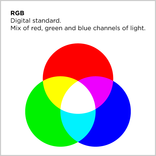 CMYK, RGB, Hex/Index – what does it all mean? For those who don’t know, these are the different color modes used in graphic design and marketing. CMYK is used for print materials, while RGB/Hex is used for digital materials.
But what’s the difference? Well, CMYK stands for Cyan, Magenta, Yellow, and Key (black), which are the four colors used in the printing process. RGB stands for Red, Green, and Blue, which are the primary colors of light. Hex or index colors are a way to represent RGB colors in web design.
Now, you may be thinking, “Great, thanks for the technical jargon, but why do I care?” Well, the answer is simple – because it affects your brand’s visual identity. Colors can look different on screen compared to how they look in print, so it’s important to choose colors that look good in both CMYK and RGB/Hex.
For example, if you choose a bright neon color for your website that looks great on screen, it may end up looking like a dull, muted version of that color in print. And nobody wants that, right?
So, what’s a business owner to do? Well, first and foremost, work with a designer who knows what they’re doing. Trust us, we’ve been around the color block a few times. Secondly, do your research and understand the differences between these color modes. That way, you can make informed decisions about your branding and marketing materials.
In conclusion, while color modes may not be the sexiest topic in the design world, they’re certainly one of the most important. By choosing colors that work well in both CMYK and RGB/Hex, you can ensure that your brand looks consistent and professional across all platforms. And at the end of the day, isn’t that what we all want?

Hi, I'm Danielle. I followed my father's footsteps in becoming a Graphic Artist. I have been a designer for 20+ years in the Phoenix Metropolitan Area. I have worked on a variety of projects and can help you create your branding vision on anything from print to web.
Sorry, the comment form is closed at this time.